Much thought and energy is given into guessing what Google might be up to every time they have a big algorithm update. One of the more notorious at the time (and still today) was termed #Mobilegeddon. Speculations were on the rise – and it was THE DAY the new Google “Mobile Friendly” Algorithm went into effect.
Panicked questions pinged all around the internet. Would it happen at midnight?
Is the witching hour EST, PST, or GMT?
Back in history – April 21, 2015…
What is going to happen exactly? Will sites that are ready (like this one) experience a spike in traffic? OR will they just not get put in the dog house?
Will sites that aren’t responsively designed get penalized? Lose ranking? Go off the grid?
#Mobilegeddon Strikes
For a very long time Google has been encouraging webmasters to make their sites friendly to the mobile phone and tablet users. They have given points for User Experience for both paid traffic and organic. This included the design of the website.
At the time, the information available was the ranking of a website
It has been interesting to watch to see where the dust settles. For a short period there were some old-style, ugly websites that rose in the desktop search rankings. This only lasted part of a day.
As a side note, and spoiler alert, the effect wasn’t exactly horrible for most websites. In the end thoughtful, white-hat, SEO always wins.
Mobile Friendly Definition
There is no such thing as having a “partially” mobile friendly page. You can however have some pages that are and others on your site that are not. This means that if you haven’t got your site done fully converted to mobile friendly, or still in the process – then I would suggest you fix your best pages first. These could be your ad landing pages or highest converting pages.
The true meaning of a mobile friendly site is a site that can be easily read and navigated by the user. This means your plugins need to be considered as well. For Example; if you have a lightbox popup that can’t be X’d out on a SmartPhone then you need to get rid of that plugin and replace it with one that is designed for mobile use.
Some simple questions you can answer will help you decide if your site is or not.
1. Are you using flash? (stop it!)
2. When you look at a webpage on the SmartPhone – do you have to “zoom” to read it?
3. Does a scroll bar show at the bottom of the screen so you have to scroll back and forth to view the content?
4. Are your content or menu links so close together that you accidently tap more than one?
If you answered YES to the above questions you do not have a mobile friendly website.
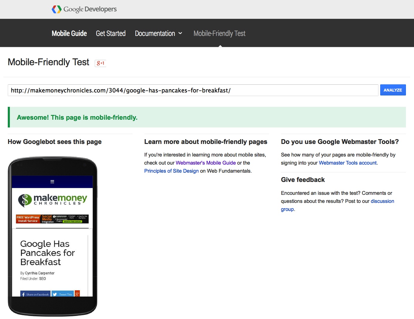
It’s nice when Google say’s you’re AWESOME!!
Check your web pages to see if they are Mobile Friendly using the Google tool here.
If you notice from the picture (above) of this website on mobile you will see how the top menu has collapsed into a pancake pile. When you tap on it the full menu appears. Not all responsive themes will do that leaving a large menu filling up a small iPhone screen.

How to Make a Website Mobile Friendly
Unless you have a good reason NOT to – why not cross over to using WordPress? If you already have then it is as simple as upgrading to a responsive theme. They are readily available for free – although I would suggest you choose a paid one.
Paid themes are supported as well as being updated so you won’t have to worry about being left behind in the technical world. As an example – I use the Genesis Framework and dress it with Pro Child theme. The framework is updated as needed in unison with all the WordPress updates. The child theme has gone through its morphing following the HTML5 demands and the need to have a mobile friendly site.
BEWARE: Free themes won’t necessarily be updated or supply a child theme.
Also, the great thing about Genesis is you can dress and undress to your hearts content with every new theme they come up with (which is often) for no additional money – provided you invested in the one time purchase for the Pro Plus Package! Plus they have lots of useful plugins to help make designing simpler and to add power and pizzazz to your site.
It’s Not Too Late
The updates are in real time which means that as soon as you re-index your new pages you should be good to go.
Make the leap and contact us about how to get your business website mobile friendly today!